Shipped in 2020

Overview
Finshots was gaining traction as a go-to platform for financial news, primarily through email newsletters and a website. However, as our readership grew, so did the challenges.
Readers loved our content but found it difficult to navigate and revisit old stories through emails. Social media was buzzing with demands for a more streamlined and engaging way to access our content.
Role
Visual designer
Product designer
Duration
4 months, Dec' 20
Tools
Figma
Adobe XD
After effects
Illustrator
Team
Arif, Lead SWE
manoranjan, SWE
Lokesh, CTO
Shaily, SWE
Discover
The journey began with a simple question: Why are users struggling to stay engaged with Finshots’ content, despite its growing popularity? We dove into the data—Google Play Store reviews, social media feedback, and direct user queries—only to realize a common theme. Users loved the content but felt overwhelmed by the scattered channels (emails, social posts) and struggled to revisit or follow up on financial news they found valuable. The question wasn't about content quality; it was about accessibility. Armed with this insight, we set out to truly understand our users. I initiated a series of surveys and interviews to uncover pain points, motivations, and behaviors. One recurring pain point? The lack of a dedicated, streamlined platform that could deliver financial news without the noise.
Navigation Issues: Frequent readers found it difficult to navigate through old stories via scrolling through our website and emails.
User Demand: There was a growing demand on social media for a more accessible and centralized platform.
Define & Develop
Our research revealed that users wanted a mobile-first platform where they could easily access and personalize content. The challenge was to create a dedicated app that provided a clean, engaging experience, offering tailored financial news without the distractions of multiple channels.
Using the Double Diamond process, we brainstormed solutions, iterating on wireframes based on user feedback. Key features included a personalized news feed, article bookmarking, and push notifications. Testing helped refine the app design, ensuring seamless navigation and a user-friendly interface


Deliver
Our research revealed that users wanted a mobile-first platform where they could easily access and personalize content. The challenge was to create a dedicated app that provided a clean, engaging experience, offering tailored financial news without the distractions of multiple channels.
Using the Double Diamond process, we brainstormed solutions, iterating on wireframes based on user feedback. Key features included a personalized news feed, article bookmarking, and push notifications. Testing helped refine the app design, ensuring seamless navigation and a user-friendly interface
Key Features Shipped
Intuitive Navigation
Created a simple, sleek interface that makes it easier for users to find what they're looking for. It includes categories, filters, and search options for browsing through both new and old stories.

Interactive Infographics Tab
Introduced interactive elements like infographics and tappable charts, making complex financial data more engaging.

Accessibility
we included things like customizable text sizes and dark mode to make sure everyone can use the app.

Custom Notifications
Created notification system! Users can pick how often they get updates and when they receive notifications.
Coffee loader Animations
Coffee loader. The contents used to take time to load, so we decided to come up with a good loader for finshots, which are like coffee shots. To make it more relatable, we designed a coffee brewing animation as our loader.


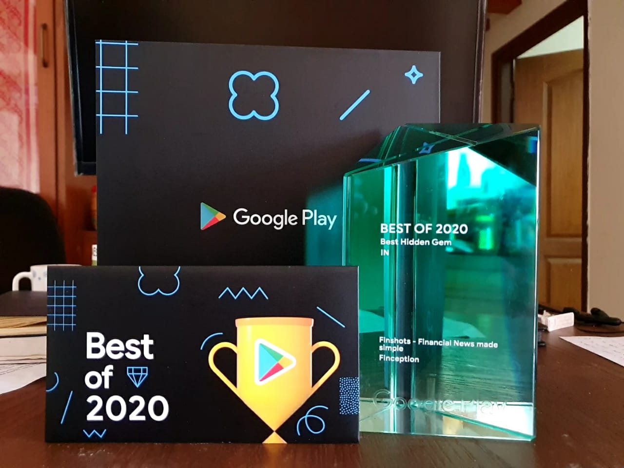
We had a solid 4.9 rating from the beginning, and it stayed that way for over 3 years.
In just 8 months, Finshots got 100k+ downloads on the Play Store.
People are giving awesome reviews on the Play Store and social media.